
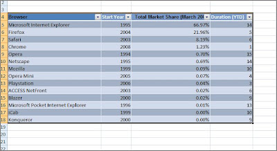
The information in my excel here is about the market share of numerous browsers for March 2009 which I obtained from Market Share site.

First of all, let me format the data block into a table to ease the process of adding columns, rows and formula.

I have just added another column for the existence duration of each browser respectively. Formula used is 2009 - (Start Year), simple right.

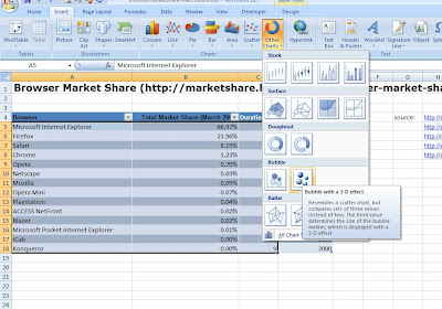
I have moved the columns around a bit so that I can get the exact visualization for my bubble chart. Ok, the most obvious difference of the bubble chart compared to the rest is that it needs 3 parameters - x, y, and z value which need to have numerical value. Right now, x-axis is the Start Year (Release Year) of the browser, y-axis is the percentage of Market Share (March 2009) for the browser and z value would be represented by the size of the bubble which in my chart reflects the duration or how long the browser has been in the market. So that's regarding understanding and positioning your data.

Let's start creating the chart, select the data for column 2 till column 4 (Start Year, Total Market Share, Duration), then click on the Insert tab, and in the Charts group, choose 'Other Charts', in the drop down, you will see 'Bubble with a 3-D effect', alternatively you could use the Office 2007 shortcut keys - simply type Alt (to see the shourtcut keys) - N (Insert tab) - O (Other Charts)
There you go, your very own Bubble chart.

There you go, your very own Bubble chart.

My work's not done yet, for I'm not too satisfied with how it looks. I want each bubble to represent each browser and have it's own significant colour. When the chart is generated automatically (remember earlier I mentioned that x,y,and z has to have numerical value) very minimal 'personalization' so to speak was done to the values.
Let's make our chart look better, look at the ribbon, the contextual tab for Chart Tools has appeared and in the Design tab, click on Select Data.
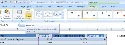
In the dialog box, what we need to do is to edit the Series.

In the dialog box, what we need to do is to edit the Series.

Choose the appropriate values for the Series Name, x, y and z value.

So for the first bubble, the values should look like this, I have highlighted the data row for the bubble.

Next, 'Add' the Series and do the same thing for all the browsers' information.


Finally, the 'Select Data' dialog box would have all the browser names enlisted in the Legend Entries area.

Do you like what you see... I know I do :)


Very cute... can the bubbles spin too? =)
ReplyDeleteOn a more pragmatic note, is it possible to do an on-demand or automatic refresh (upon workbook launch) of the website information to feed into the table, e.g. HTTP/XML call?
Yes this is possible.
ReplyDeleteWithin Excel's ribbon, choose the Data tab, and the option to 'Get External Data - From Web', this will launch browser-like window within excel itself. Type into the Address box the URL of the site where you obtain information from, and when the site is loaded, you will find tiny arrows in yellow boxes which are used to select the table/region which contains the info that you need. Make your selection and press the 'Import' button to copy the table into your excel sheet at the location that you specify.
This is a live query now and when you go through 'Properties' (get this also by right-clicking the copied web data table) you will see the options that are within your control which one of the refreshal options is done upon the opening of the excel document.
I will create a posting on this soon to illustrate better.