
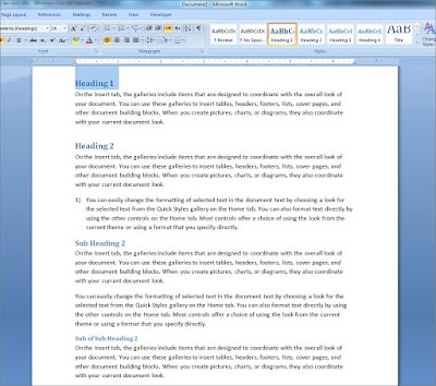
As usual, I have a dummy document ready here which the headings have been formatted into desired styles, these screenshots will give you a run-through on the diffrent headings which have been set.
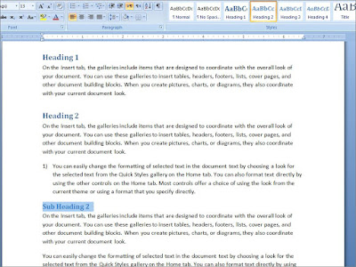
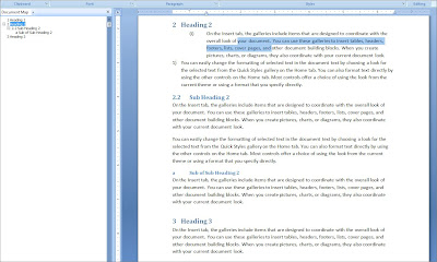
 Let's have a better look via the Document Map.
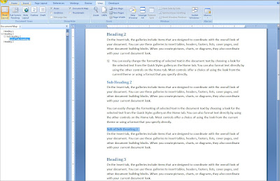
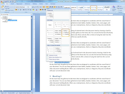
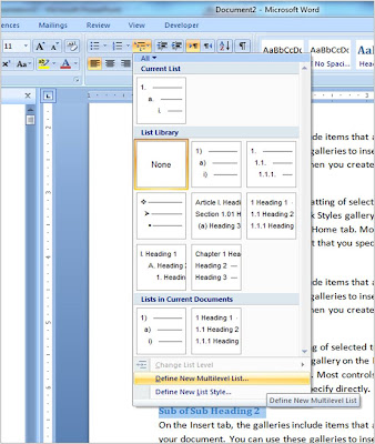
In the Home tab, within the Paragraph group, you will find 'Multilevel List', and here there are already a few preformatted templates for you to choose from.
This is what you will see in the 'Formatting for number' text box.
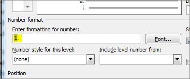
When you have done that, then choose the formatting for after the '.' (point) symbol.
 Here is a clearer screenshot to show the changes in the settings that I have made for Level 2 in the multilevel list.

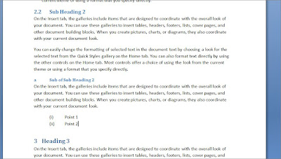


 Let's have a better look via the Document Map.
In the Home tab, within the Paragraph group, you will find 'Multilevel List', and here there are already a few preformatted templates for you to choose from.

I want to have control on how my multilevel list is formatted, and need to do my own customization based on the format which has been fixed for me to follow (for instance).

First step, click on 'Define New Multilevel List' and when the window appears, click on the 'More' button at the bottom to have a look at more options.
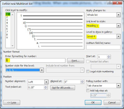
Here's the setting for the first level, I have highlighted in yellow the areas which I have changed. I want the first level to be linked to Heading 1, and for this customized multilevel list to show up to 4 levels in the gallery.
Here's the setting for the first level, I have highlighted in yellow the areas which I have changed. I want the first level to be linked to Heading 1, and for this customized multilevel list to show up to 4 levels in the gallery.

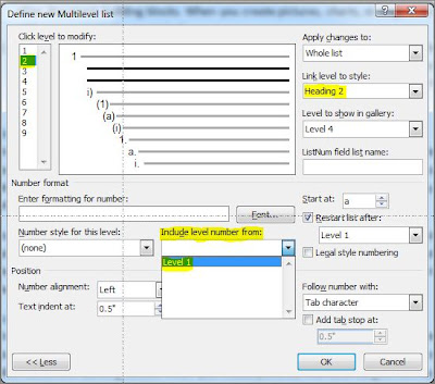
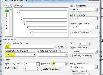
For the second level, I want to inherit the number from Level 1 followed by ".1" and so on. To do this, clear the formatting for number text box first, then choose 'Level 1' from the dropdown of 'Include level number from'.

This is what you will see in the 'Formatting for number' text box.

When you have done that, then choose the formatting for after the '.' (point) symbol.
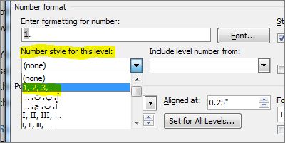 Here is a clearer screenshot to show the changes in the settings that I have made for Level 2 in the multilevel list.
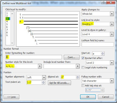
Settings for Level 3, notice for all the changes that is specified, it is previewed on the top left corner so that changes especially in the level and text alignment can be done correctly.

Lastly, level number 4 settings are as follows:

Click on the Ok button and the customized multilvel list is applied to your document.

Here I have typed "(i)" for a point which I have inserted in the document, and when I press the , the formatting for Level 4 automatically kicks in.

When the multilevel list is working as you expected, just right-click and 'Save in List Library". Easy peasy :)


